- Creative Discipline
- Posts
- The Ad That Defeats the Objection Before You Can Form It
The Ad That Defeats the Objection Before You Can Form It
How a functional coffee brand used a background image to do more selling than any headline could.

Chase Mohseni
June 16, 2026

How a functional coffee brand used a background image to do more selling than any headline could.
Hey everyone, Chase from CreativeOS here. Let’s analyze this offer ad from Everyday Dose - who is generally focused on UGC Video creative.
Most functional supplement brands make the same mistake.
They put the product front and center. Clinical photography. White backgrounds. Ingredient callouts. A headline about focus or gut health or whatever the benefit is.
And the whole time, the customer is thinking: but does it taste like dirt?
Everyday Dose answered that question before it could be asked — and they did it with a background image.
Here's everything this ad is doing right.
What you'll learn:
Why the visual is doing more objection handling than the copy
How 93% converts better than 100% — and why that's not an accident
The specific reason "no weird earthy taste" is the most important line in the ad

The background image is the headline.
Before you read a word of copy, you're looking at a swirling iced latte with condensation-covered ice cubes.
That's not decoration. That's a positioning statement.
Functional mushroom coffee has a reputation problem. People who've tried competitors know the taste — chalky, earthy, slightly medicinal. That association is the #1 reason someone in the consideration phase doesn't convert.
Everyday Dose solved this with a visual, not a claim. The iced coffee background says this tastes like the thing you already love before a single word of copy loads. By the time you read "93% love the taste," you already half-believe it because the image already told you.
This is the most underused move in supplement advertising. Don't claim the taste is good. Make the ad look like the taste is good.
93% is more credible than 100% — and they know it.
The stat badge says: "93% LOVE the taste."
Not 95. Not "nearly all customers." 93.
That specific, imperfect number is doing something precise. A perfect score reads as marketing. An imperfect score reads as measurement.
If Everyday Dose had said "customers love the taste" or even "95% love the taste," it would have landed as a typical brand claim. 93% reads like someone actually counted. The seven percent who didn't love it make the ninety-three who did believable.
This is the Pratfall Effect applied to statistics. The small imperfection in the number is exactly what makes the number trustworthy. The fine print confirms it: sample sizes over 10,000. That's not a small survey run on existing fans. That's a real data set.
Specific number plus large sample size is as close to bulletproof social proof as a DTC brand can get.
"No weird earthy taste" is the whole sale.
The five-star review in the top right corner: "It actually tastes SO good, no weird earthy taste."
This line is doing more conversion work than anything else in the ad.
Here's why: in a category where the taste objection is the primary barrier to purchase, the most powerful thing you can say isn't a benefit — it's a fear removal. Benefits tell someone why they should want the product. Fear removal tells someone why the reason they've been avoiding it no longer applies.
"No weird earthy taste" speaks directly to the person who's already tried a competitor and been burned. That person isn't waiting to be sold on the benefits of functional mushrooms — they already want those benefits. They're waiting for proof that this one is different.
Pulling that specific phrase from a real customer review and surfacing it as the primary social quote is deliberate creative strategy. It's not the most enthusiastic review. It's the most useful review — the one that addresses the exact objection standing between someone and the purchase.
The ad that worked, working harder.
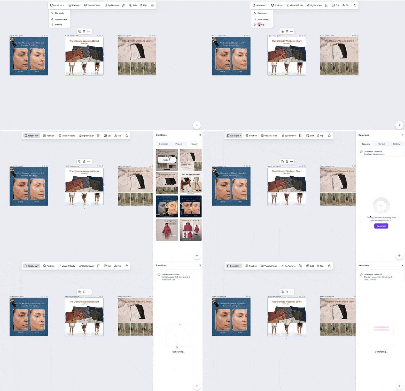
Not because you need more ads — because the one that worked deserves a second life.
Faster. Sharper. Built around how winners actually compound — in loops, not launches.
Feed it your best-performing ad. Get the next generation. Same DNA, new angles, ready to test.
Iteration Engine. Image-to-image. Built-in brand memory. The ad that worked, working harder.
CreativeOS is where winners become systems.
he price anchor closes desire that the proof already created.
By the time you get to $45 $29, the ad has already done three things:
Made the product look delicious. Proved 93% of 10,000+ people agree. Removed the taste objection with a specific customer voice.
The discount isn't creating desire — it's converting desire that already exists. That's the right order. Most ads put the price front and center before they've given the customer a reason to want the product. Everyday Dose earns the price reveal.
The strikethrough anchor ($45 crossed out to $29) is a 35% discount. But because you've already been sold by the time you see it, the discount registers as a closing argument, not a desperate plea. Same mechanism, completely different psychological position depending on what came before it.
3 Ways This Ad Could Be Even Stronger
1. Tell me what's in the Starter Kit. The product shot is small and hard to read. The kit includes coffee, supplements, accessories, and an app — but the ad never says that. "Coffee, mushrooms, and a 30-day tracking app" in one line would make the $29 feel even more like a steal. Right now you're buying something called a Starter Kit without knowing what starts.
2. Surface the sample size in the main ad. "93% of 10,000+ customers love the taste" is buried in fine print. Moving that number into the badge — even just "93% (10,000+ reviews)" — would make the stat significantly more impactful. The large sample size is the thing that makes the percentage credible. Right now it's doing its work quietly when it should be loud.
3. The CTA arrow points nowhere specific. "The Starter Kit →" implies a landing page that picks up where this ad left off — but if it drops to a generic homepage, there's a conversion gap. The landing page should open with the same iced coffee visual, the same 93% stat, and the same review quote. The ad made a promise. The landing page has to keep it.
What This Teaches Us About Creative Discipline
Everyday Dose didn't try to out-claim the category.
They out-answered it.
Every functional coffee competitor is talking about nootropics and adaptogens and sustained energy. Everyday Dose looked at their customer data, found the real objection, and built an entire ad around removing it.
The discipline here is restraint. They didn't lead with every benefit the product has. They led with the one fear standing between a customer and the purchase — and they answered it with social proof, a specific stat, and a visual that made the answer feel true before anyone read a word.
Find the objection. Build the ad around removing it. That's the whole brief.
How to Apply This Week
Find your category's taste problem. What's the #1 thing people in your space have been burned by before? That's your "no weird earthy taste" moment. Pull reviews from competitors, from Reddit, from your own one-star feedback. The objection is in there. Surface it in your creative.
Make your ad look like the answer, not just say it. Everyday Dose didn't write "tastes great." They showed an iced latte. What visual could your ad use to communicate the benefit before the copy loads? Background, format, and aesthetic are all doing persuasion work whether you design them to or not.
Audit your social proof for the most useful quote, not the most enthusiastic one. The best review in your bank might not be the five-star raving fan. It might be the person who almost didn't buy, had the objection everyone has, and then got past it. That review converts cold traffic. The raving fan converts people who are already sold.
Keep Creating,
Chase
P.S. - Sign up for our events calendar so you can get access to all the experts we work with helping you build your creative intelligence in real time.
P.P.S. — A few friends have been working with Automatic, an AI integration agency, on custom automations and internal systems. What they've built is genuinely impressive. Worth a look if you're trying to turn AI into real operational leverage instead of another tab open in your browser.